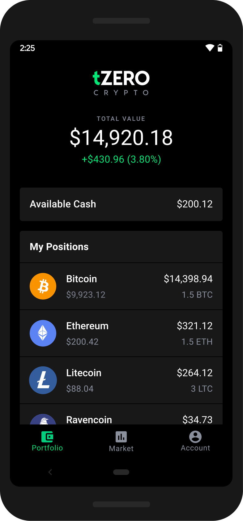
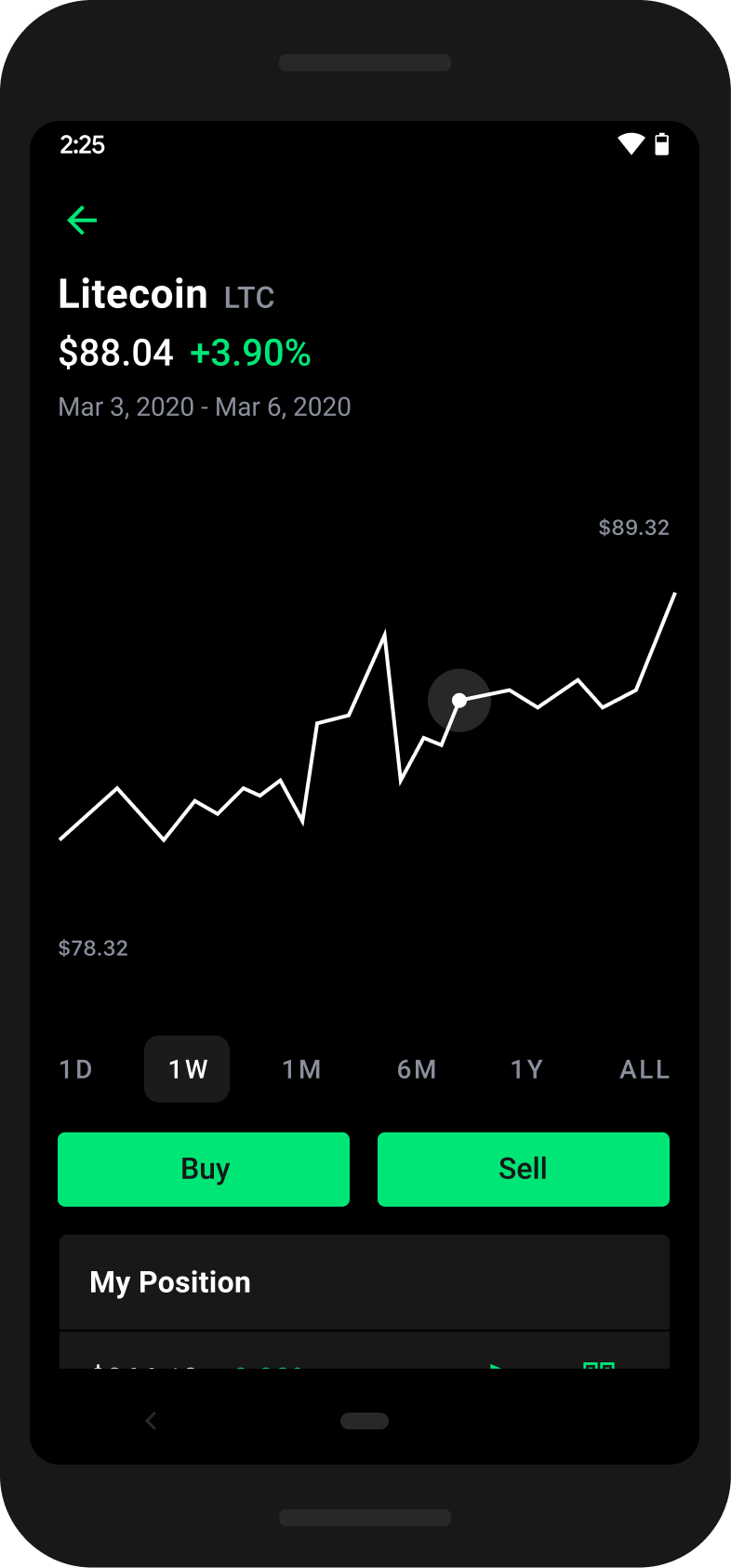
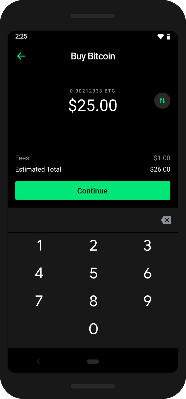
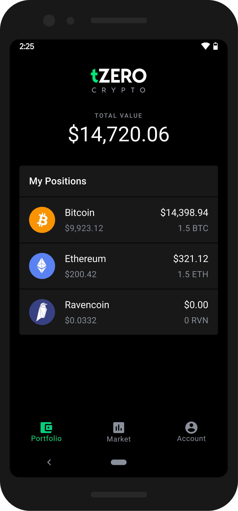
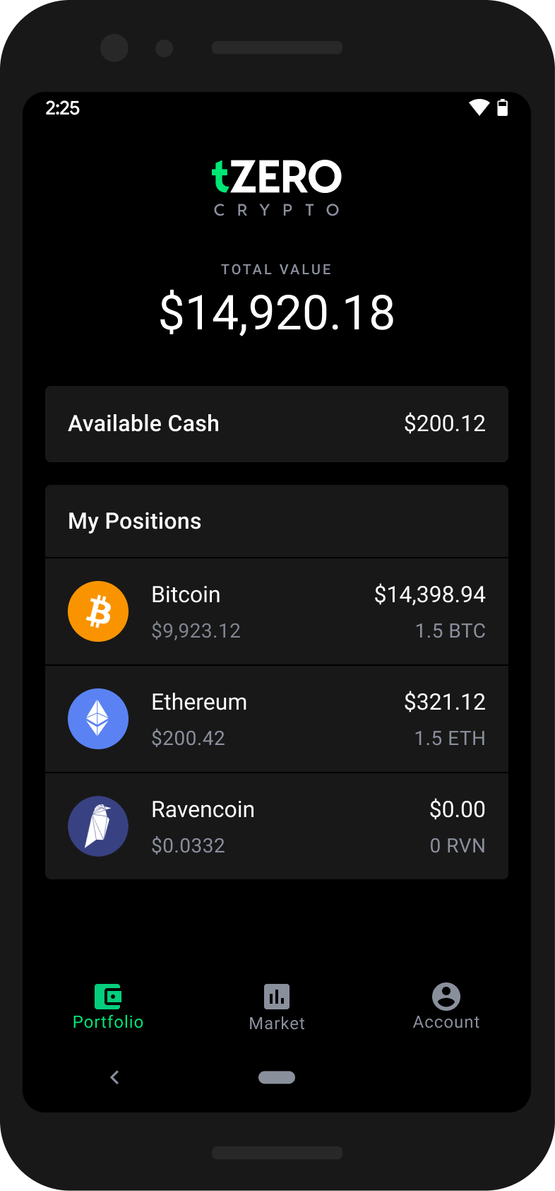
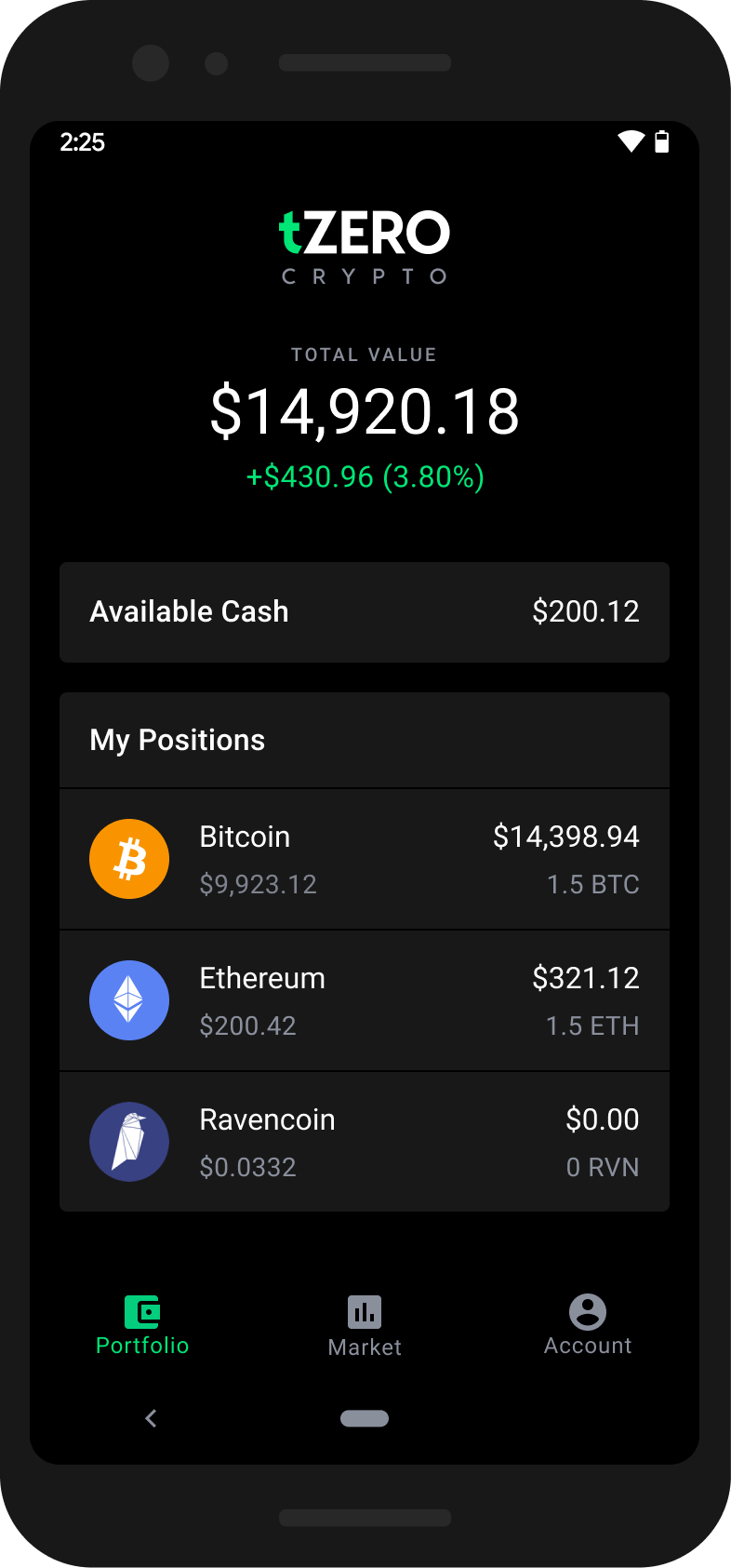
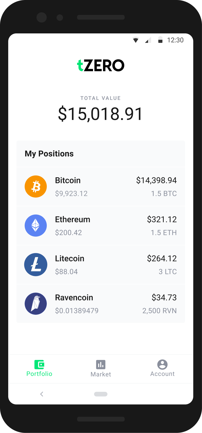
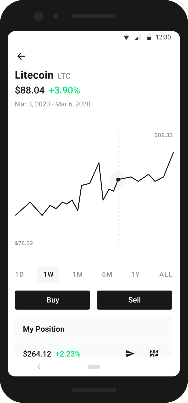
An Easy and Intuitive Way to Buy and Sell Cryptocurrency
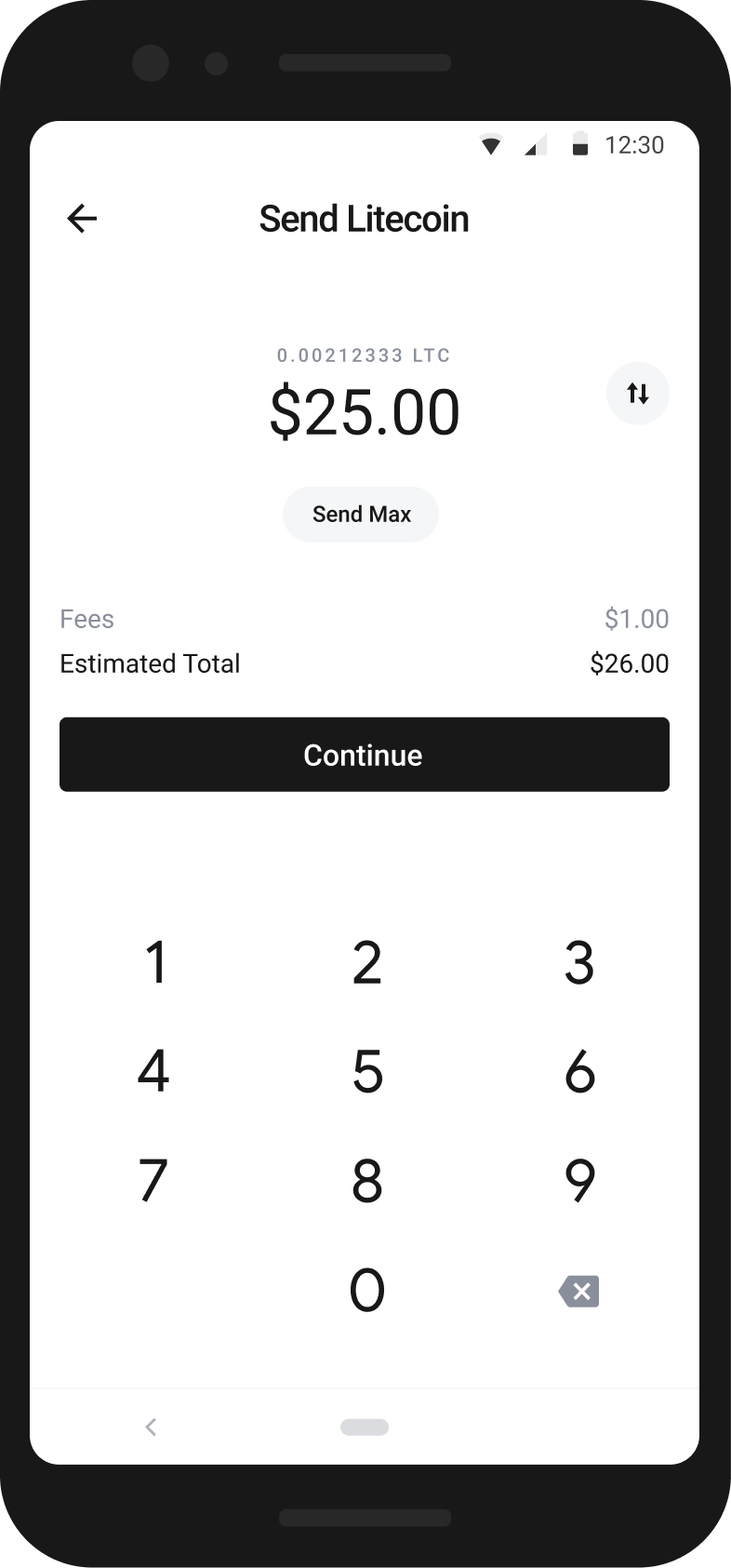
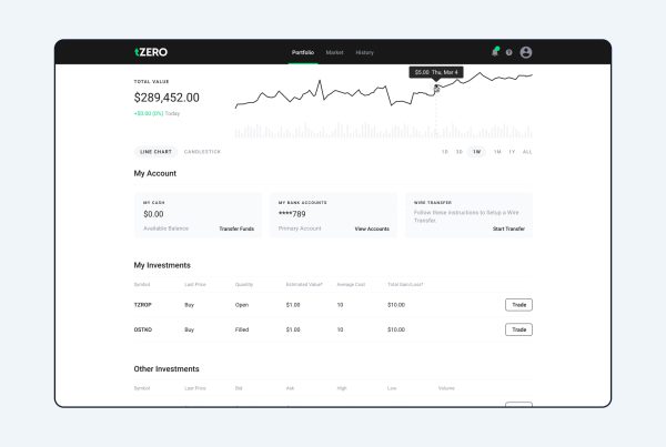
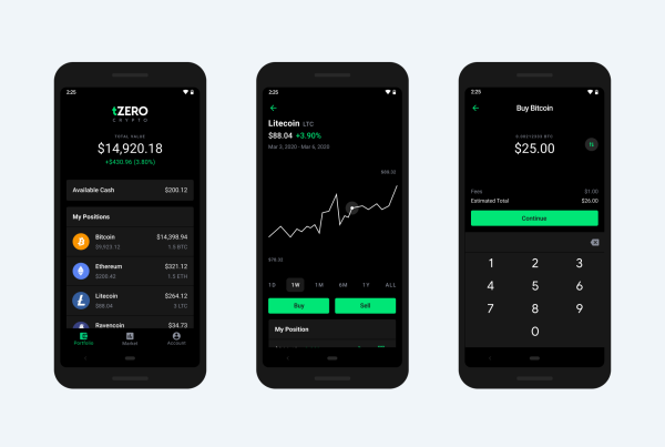
We collectively decided to focus on an easy and intuitive way to buy and sell cryptocurrency that is familiar and intuitive to an Android user by identifying the challenges we wanted to solve since our first launch, we started to validate our concept, using real customers as beta testers. We interviewed top investors to understand how they bought and sold crypto, which tools they used to do so, and their general thoughts on the tZERO App as a potential addition to their workflow. Their feedback convinced us we were on the right track. So we ran additional interviews, conducted surveys, and reviewed data reports to further confirm our hypothesis. It quickly became clear: there really was a need to improve the cryptocurrency portfolio management process.
Jumping Into the Work
Working together with cross functional partners in engineering and product management we found the right experience our investment tool would need to provide by matching the features necessary for a minimum viable product through User Story mapping which helped us document the product roadmap.
With the design and development of our product well under way, we started on branding. We needed something bold that would stand out from competitors, while still feeling familiar to our investors. We created a strong tZERO logo mark that speaks to the communication between investors and the portfolios they manage. We developed a bold color palette to establish a strong, recognizable brand identity and improve user wayfinding.
In short amount of time we conducted research, designed the user experience, built a prototype, held a beta test, and shipped both an iOS and Android version of the app.
Our Challenges and Solutions
With Android being a popular mobile platform, Android app development is challenging. There are tools and libraries to simplify the process, Android’s flexible, open nature can challenge development as much as it can accelerate it. In order to understand our options and guidelines we all needed to become comfortable using an Android device.
A well-designed, intuitive interface can elevate an app. But even the most innovative app idea would fail if the UI was hard to use. Great UX might look simple, it’s not easy to achieve. It’s not enough for the app to be useful – it also has to be enjoyable to use.
One of the many traps designers can fall into is implementing the UX for themselves and not from the users’ perspective. This could backfire because what you find acceptable might not necessarily be the right fit for your target audience. Given this exact reason we started using our Android devices during the day more frequently to ensure our success.
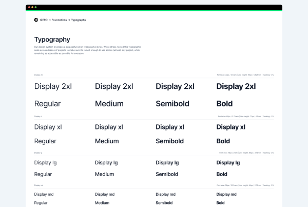
In order ensure success we had to reflect on our design system and design processes we had in place. Following the structure we had in place would allow our teams to move quicker. With tZero providing quick timelines we had to reuse components and make sure every component was compatible with iOS and Android.
Our teams worked well in Jira and we managed our task specific conversations there so others could follow and step in when additional support was needed. I had the opportunity to lead a team of designers and weekly we would meet to plan tasks, review ongoing work and critique each other’s designs. Even though we had to move fast we did not want to compromise on our design values.
Because of the experience at tZero I have an appreciation for design systems and processes, although they take more time upfront they really help down the road.

